code
#load libraries
library(ggplot2)
library(tidyverse)
library(ggiraph)
library(plotly)
library(systemfonts)While I was working on a project on EV sales data I ran into an issue with a date variable. My dataset had the date variable in month-year format. I wanted to plot electric vehicles sales where the x-axis is labeled with month/year in chronological order.
#load libraries
library(ggplot2)
library(tidyverse)
library(ggiraph)
library(plotly)
library(systemfonts)As with any data science project, it all starts with a clean set of data. Working on this dataset I learned that R cannot read date unless it’s in full day/month/year format. Otherwise, it would read it as a character, which was the case with my data since the date was in month-year format. The simple fix for this issue is to add a day field to the character string (thanks Kara Woo!). I pasted a 01 to all date values and set it’s class to a date and changed the format to day/month/year.
I was done with the date variable but there was still some work to be done on the sales variable because the numbers had the thousand comma, which R would read as a character. To change the sales variable from character to numeric, I used the gsub() function to remove the comma from the variable. I then changed it to numeric.
ev_sales <- read.csv("~/Desktop/UtilityResponse/ev sales data.csv")
head(ev_sales)
ev_type Sales date year size Size.pct
1 BEV 23,735 1/21 2021 Small SUV 0.31
2 BEV 20,321 2/21 2021 Small SUV 0.30
3 BEV 33,370 3/21 2021 Small SUV 0.32
4 BEV 32,115 4/21 2021 Small SUV 0.31
5 BEV 37,967 5/21 2021 Small SUV 0.35
6 BEV 35,813 6/21 2021 Small SUV 0.35#data download and prep
ev_sales_data <- read.csv("~/Desktop/UtilityResponse/ev sales data.csv")
ev_sales_data$date <-as.Date(paste0("01/", ev_sales_data$date), format = "%d/%m/%y")
ev_sales_data$Sales <- gsub(",", "", ev_sales_data$Sales)
ev_sales_data$Sales <- as.numeric(ev_sales_data$Sales)
ev_sales <- ev_sales_data %>% select("ev_type", "Sales","date", "year") %>%
rename(sales = "Sales") %>% drop_na()After that, the rest is easy. The ggplot2 package is typically good with arranging data labels on plot axis in the final output once the data is clean and in the correct format. Using the scales package, as shown in the plot code below.
#plotting
ev_plot <- ggplot(ev_sales, aes(x = date, y = sales)) +
  geom_line(aes(color = ev_type)) +
  geom_point(aes(color = ev_type),
             shape= "diamond",
             stroke = .5) +
  theme_minimal() +
  labs(title = "Monthly Electric Vehicles Sales",
       y = "Total Monthly Sales",
       caption = "Source: U.S. Department of Energy and Argonne National Laboratory",
       color = NULL
       ) +
  theme(legend.position = "top",
        plot.title.position = "plot",
        panel.border = element_blank(),
        panel.grid.major.x = element_line(),
        panel.grid.minor = element_blank(),
        axis.title.x = element_blank()) +
  scale_y_continuous(labels = scales::label_comma()) +
  scale_x_date(breaks = "month", labels = scales::label_date_short(),
               expand = c(mult = 0, add = 10)) +
  scale_color_manual(values = c("#32a852", "#54309c"))


ev_plot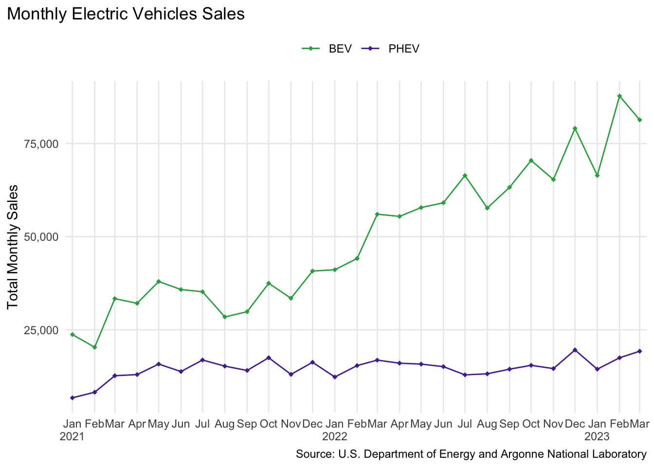
And here is the interactive version of the plot using ggplotly.
#create interactive plot with ggplotly
ev_plot2 <- ggplotly(ev_plot, source = "select", tooltip = c("sales")) %>%
  layout(legend = list(orientation = "h", x = 0.4, y =1.05),
         annotations = list(x = 1, y =-0.13,
                            text = "Source: U.S. Department of Energy and Argonne National Laboratory",
                            showarrow = F, xref='paper', yref='paper',
                            xanchor='right', yanchor='auto', xshift=0, yshift=0),
         font=list(size=10, color="black"))

ev_plot2